By: Alexandra Kafka Larsson, support by Jonathan Hörnhagen and the community
I wrote about Powerpoint 10 years ago on this blog and it is time for a revisit. The slide deck is something most people love to hate and hate to love. It also feels relevant as with more remote workers, sharing screens is becoming synonymous with sharing a slide deck. The inspiration for my last article came after reading ”We Have Met the Enemy and He Is PowerPoint” by Elisabeth Bumiller, essentially a big outcry to stop using Powerpoint because it supposedly brings more stupidity in decision-making. Back then I was busy working with the digitalization of military intelligence work. We were developing methods and technology to handle increasingly complex conflict areas around the world and one realization was that only putting together situation updates in Powerpoint, did not cut it anymore. But what has happened since and what are the key issues of Powerpoint today? We have 10 observations that are easily overlooked.
Key takeaways
Slide decks are pervasive in all things analysis and often end up as the de facto integration point for collected content, lacking metadata and traceability.
Slides with many bullet points lead to oversimplification and lack of context, ignited by higher expectations on style and engaging storytelling.
The slide deck format suffers from a dissociative identity disorder. It acts as a densely written report ready for documentation and a simple but engaging background for public speaking, often in the same deck.
Changes in perception, style and simplification
A common objection used to be that Powerpoint was more about style than content. Remember the presentations where someone used way too many animations and sound effects? That was 2005. Today, we value style more. We value good storytelling, great design, and have learned to use animations resembling the graphics we see in streaming shows or movies. When presentations really matter, we bring in creative agencies to handle it. The issue with the slide deck format however remains. It is elegantly put in the report “Fixing Intel: A Blueprint for Making Intelligence Relevant in Afghanistan”:
The format of intelligence products matters. Commanders who think PowerPoint storyboards and color-coded spreadsheets are adequate for describing the Afghan conflict and its complexities have some soul searching to do.”
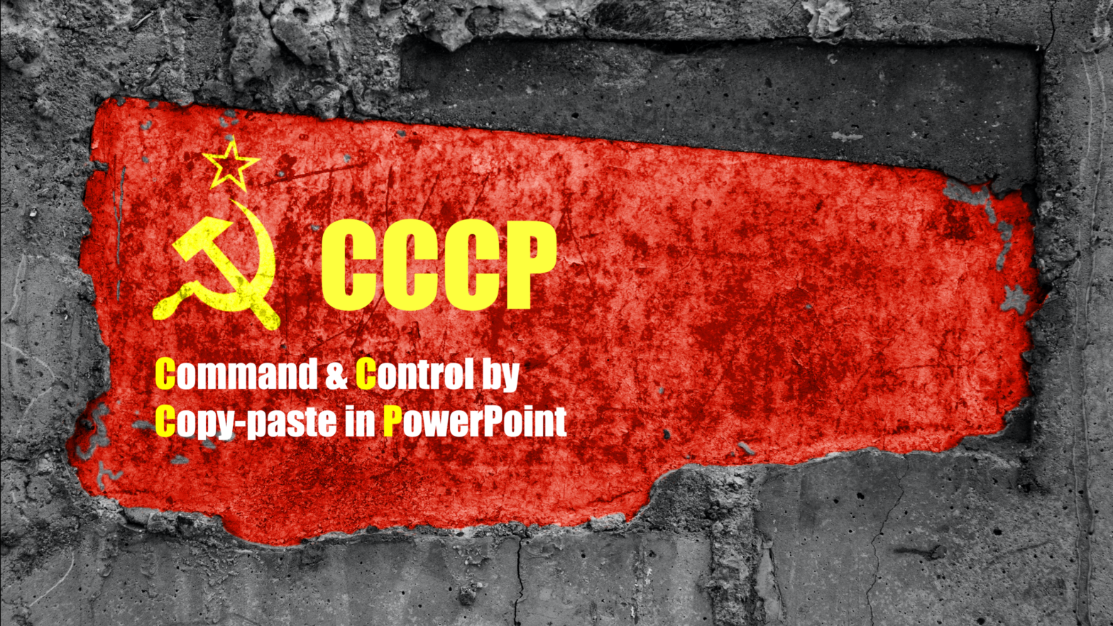
These were quite hard words directed towards commanders in ISAF and the US Component in Afghanistan. It was valid then and still is now. I think the underlying issue is a desire to simplify things that should not be simplified. Military leaders want to be concise and like to know what message to stick to. When you entered military headquarters you quickly realized that this was mainly about Powerpoint slide decks. What bothered me specifically in the military space was often a lack of vision when it came to IT-applications for higher levels of military command. Everything that mattered had to become a Powerpoint. Many officers, this one included, made careers essentially by being really good at quickly putting together information in slide decks. There is even a term for that “Command and Control by Copy-paste in PowerPoint”. In my own presentations, I (Alexandra) translated that to the abbreviation “CCCP” to reference the Russian acronym of the Soviet Union to drive home the point. It is bad.
Problem 1. Slide decks are used as a container for information integration
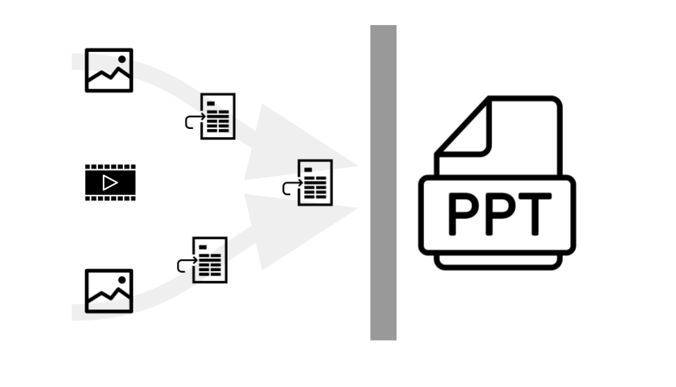
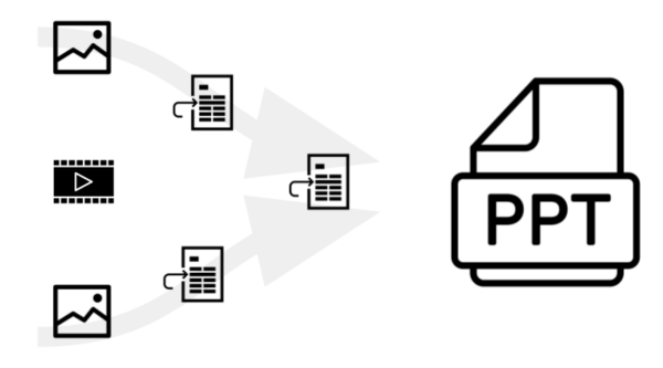 As we embark on different research projects where we collect data, we often end up at the same place. Slide decks have become the main container where people collate their information. Pieces of text, images, and videos are being pasted into the slide deck as we do our research. Because the slide deck at some point will be the end-product, it often feels more efficient doing the research directly in it. That naturally mashes up content and layout either because of a static template or because the visual layout is key to showing it on a screen. A lack of separation of content and layout makes it hard to repurpose the content in different channels or forms without lots of manual work. As presentations are being used for information integration, it also means they become crammed with data, acting as a report rather than a presentation optimized as a backdrop for storytelling. Because we want an all-in-one deck, a lot needs to be brought for sacrifice at the altar of the slide deck.
Problem 2. Bullets oversimplify
With Powerpoint comes a method enforced by the format – boiling information down to bullet points. It is perfect for fine-tuned marketing messages that want to leave just a few critical words or concepts with the audience, less so for reasoning around complex issues like modern conflicts. Powerpoint sets out to convey a message when we instead should focus on improving our understanding. At Content Perspective, we like to think of knowledge sharing beyond just a presentation, we want a Knowledge Experience focused on understanding more and supporting interactive discussions.
Case Study. Why the Afghan “Spaghetti image” is actually rather good
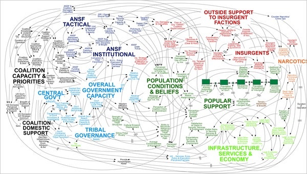
The New York Times article we began with by Elisabeth Bumiller contains images from the Afghanistan conflict with hundreds of nodes being connected by arrows in different colors. This is an example of the problems of using Powerpoint. The issue with that slide is that it shows a static image pasted into Powerpoint, likely created in Consideo, a data modeling tool. That JPEG, or whatever it is, has no connection to the underlying data. Imagine instead that same image as a dynamic and interactive visualization of objects with relationships to objects powering the lines. Metadata would allow filtering based on object and relationship attributes. Suddenly, that image we saw would be just one of a multitude of perspectives on the conflict. Imagine if all those nodes were connected to underlying data such as reports and written analysis. Then it becomes easier even for an outsider to start understanding the conflict.
I also think we need to talk about personas and target audiences. Some visualizations are not really intended for the decision-maker but work best for the seasoned expert used to the format. That takes some time to learn. Sometimes the product is just an artifact, acting as a catalyst for the discussion a specific group of people had. To fully understand the artifact, you need interactive discussions. The delivery of that kind of analytical product then needs to be an interactive session where the recipients are engaged with the material, not passively listening to it.
I do not want to rant on the spaghetti image itself, it is rather good because at least it is not oversimplified bullets. The graph is something you could reflect on for hours while observing it. However, it must not be an image that is manually updated in Powerpoint, it has to be a generated visualization from source data in a database.
Problem 3. Static data without traceability to sources and facts
After content is pasted into a slide deck, source references and links to the underlying files are broken, often ending up in inaccessible information silos.
The nature of Powerpoint presentations is very static. Slide decks usually represent a manually crafted snapshot of a given situation. They can become outdated very quickly. As time goes on there are more and more static presentations that should be regularly updated but never are. Typically, they disappear in file shares without any monitoring process of which presentations need to be updated and not. One explanation is that most traceability of information within slide decks is lost when they are being created. A copy of some data went somewhere, after part of it was pasted into a slide deck, which someone else found, copied some more from, and finally put somewhere else.
It becomes impossible to keep track of the origins of bullets, diagrams, and images and it makes it difficult to trust the information when the author is not available to explain each bullet. It also makes collaboration a lot harder, especially so for 24/7 work if a night shift needs to continue the work. No amount of extensive hand-over processes can mitigate that in the long run.
Problem 4. Labor-intensive work with slide decks limits the time to think
Also described in the New York Times article, there are quite an amount of junior officers that spend time collating information and transforming it into presentations. To begin with, there is much to be done to support this kind of analytical work where users are navigating and searching for relevant pieces of information. After the information has been collated, the next step is to transform that into a presentation using a template of some kind. Decision-makers usually have an opinion of how they want their presentations set up in order to quickly recognize the structure of the information. Add to that how most organizations have a graphical profile to adhere to, which may limit the content experience by more static styling and formatting. To me, the latter really calls for a more semi-automated way of compiling information. I am not saying that all content can be templated, but where it is possible it would save lots of time. Hopefully, time that could be spent thinking instead of searching and formatting in Powerpoint. Freeing up more time to think is crucial. Too much time today is eaten up by repetitive manual work in slide decks and it is getting worse. The amount of information made available is increasing.
Problem 5. Lack of interactivity makes it harder to be data-driven
Lack of dynamic or live data and interactivity stops us from being data-driven and being able to explore hypotheses together in a group.”
Another problem with these static representations like slides is that they usually take hours to compile and the flexibility in the actual briefing situation is low. If the decision-maker suddenly asks to filter the information from another perspective in a graph or a map, the unfortunate answer will be ”We will get back to you in a couple of hours”. Not exactly the best conditions to inspire actionable reflections that puts complex problems in a new light? Graphs and bar charts are often static images or, at least, disconnected from the underlying databases. Maps are often screenshots from Google Maps with no coordinate system, no zooming up and down, and little way of knowing how old the geographic data is. Images of important people, facilities, or equipment are manually entered and it is difficult to show additional images of the same thing if desired.
We become more passive when we know that most questions can only be answered by the presenter’s memory. That is not enough when we are dealing with complex information. We need to externalize our data using software and databases. With an interactive capability, we could be much more active and use software to query our externalized memory in real-time. Additionally, our presentation surface often is limited to one (and often just one) basic projector or flat-screen with no touch capability. That lack of interactivity again makes us passively listen instead of actively engaging the data. If someone steps up to a whiteboard and starts drawing, the meeting energy can increase, but today we don’t do that together in front of live dynamic data. Whatever becomes written down manually, won’t digitally be made available. A meeting environment with access to large multi-touch walls would allow more than one person to easily manipulate and interact with the data. In the COVID-era, we need to bring that same experience to our remote meetings which should be easy because multi-touch tablets like iPads are everywhere.
Problem 6. Format matters so do preparing for meetings
One thing is for sure, format matters, and formats influence thinking. There is a need for several different formats of the same information to support diverse thinking. Some argue that writing and reading short papers allows people to follow more complex reasoning. Jeff Besos, the CEO of Amazon, is famous for having people start their executive meetings by reading through a 6-page memo. That tackles the simplification aspect of the problem. The idea here is that you can force busy executives to actually get the context about the problem at hand before discussing it. Full sentences also mitigate some of the oversimplifications that bullets create. I have also seen that boards of major commercial companies require the senior management team to write “board memos” for all major investment decisions in the company. The narrative becomes the master, not the slide deck format.

Most people in knowledge work have reflected on the importance of being prepared to have a good meeting. We can all remember that high-profile meeting where you actually did your pre-reads, the meeting rooms were perfectly set up and you had invited that professional facilitator to help run it smoothly. In reality, that does not happen too often and people are too busy reading pre-reads anyway. The Besos memo ritual is a way to compensate for that too.
In the COVID-era, we have finally understood that things digital can instantly be shared and transmitted all over the world so we can do real work in different geographical locations. Interestingly Zoom and Teams meetings have made Powerpoint slides even more important. Sharing your screen often means sharing a presentation.
Problem 7. Presentation vs documentation, what function has Powerpoint?
Recording the presentation and attaching it is of course best, but rarely done. But even if you do, someone else needs to spend those 45 minutes watching it, which takes longer than skimming through more report-like slides.”
I often feel that the slide deck format is trying to be two things, often both disappointingly. Either it tries to be the perfect storytelling support that can provide a brief background intended to stir emotions in the audience, or it tries to be a fact-filled report that no one has time to read. After 5 minutes of presenting, the audience’s heads spin. The underlying need sparking the issue is to create a really engaging presentation experience and at the same time provide documentation of what we have done or what was said, all in the same slides. We also want to be able to attach it to an email or preferably share that presentation with all attendees, especially those who missed it. Therefore, it must contain all that detail which makes it possible to read and understand, at least something, without a presenter. The other type of presentation, focusing on creating the perfect narrative support, naturally contains big images and few words. It becomes more difficult to send and work with because of its big file size, and it is tough to comprehend without a presenter. That presentation needs the spoken word and the actual performance to make any sense. Recording the presentation and attaching it is of course best, but rarely done. But even if you do, someone else needs to spend those 45 minutes watching it, which takes longer than skimming through more report-like slides. The technology is readily available to have a video or sound clip automatically transcribed, but integrating it easily into the presentations means more manual work. The move to virtual meetings with Zoom and Teams has made both the recording and the distribution a lot easier which I think has changed this for the better. I have had many more meetings being recorded this year than the year before.
Case study. The Space Shuttle Columbia
One tragic example when the use of Powerpoint contributed to a disaster was the loss of Space Shuttle Columbia. The Columbia Accident Investigation Board (CAIB) took the help of Professor Edward Tufte from Yale University to analyze the communication failure that in the end made NASA unaware of the seriousness of a foam strike. In line with the previous quote about understanding conflicts through slide decks, the investigation board made the following conclusion:
At many points during its investigation, the Board was surprised to receive similar presentation slides from NASA officials in place of technical reports. The Board views the endemic use of PowerPoint briefing slides instead of technical papers as an illustration of the problematic methods of technical communication at NASA.“
Tufte continues to make the argument that the low resolution of the Powerpoint slides forced technical terms to be abbreviated thus adding ambiguity. The large font sizes for headlines also forced the shortening of content. He also notes that the typography and hierarchies provided by the bullet organization also added confusion and that in the case of NASA, some more advanced typographic features to handle math and other technical formatting was greatly needed.
During the Return to Flight work later, this was further emphasized with the following statement:
Several members of the Task Group noted, as had CAIB before them, that many of the engineering packages brought before formal control boards were documented only in PowerPoint presentations,”
Again this is connected to the split-personality nature of the Powerpoint format. The slide deck becomes the main format or container for documentation.
Problem 8. Less resolution leads to less “context”. More pixels to the people!
To further add to the Columbia findings, I have a serious issue with how briefing rooms are normally set up. Projectors in particular still have a limited resolution which means less information fits there than on most laptops. Lots of flat screens today only support full HD (1920×1080 pixels) but fortunately, 4K screens are making it into the meeting rooms. Finally! Still many corporate laptops only have underpowered integrated graphic cards with limited capability to output 4K signals to that screen. If they do, the built-in screen cannot display 4K which means that cloning the screen is impossible. Many users are not used to working with their laptops unless the screen is cloned where what you see on the laptop is what you see on the projector. Thus in essence limiting the resolution on the projector to whatever the laptop handles. Again, because many users are given cheap computers, good for little else but Microsoft’s productivity suite, the result is that we don’t use the pixels available and limit the resolution and overview, further hampering our capabilities to handle complex information.
Many of us working from home now with Zoom and Teams really appreciate having more than one screen. One for running the meeting, and the other to take notes or glance at supporting materials. In light of that, a serious flaw to most meeting rooms is that they often just have one display or projector. That makes it impossible to have supporting digital information up when running a workshop. Our short term memory is famously known to remember 5 plus minus 2 objects, so we really need to externalize information to handle complex issues. To me, it is strange that we pour vast amounts of resources into IT-platforms to store and manage our important information but then limit the number of display areas to leverage that information. The knowledge experience has to be improved. Bring more pixels to the people!
Problem 9. New to the project? Find the presentations!
Judging the quality of content without sources becomes really difficult, it boils down to the influence and trust of the presenter.”
So you have got a new job or just joined an existing project. What do you do to get yourself up to speed? You try to find presentations from previous work. After a while, you start finding some Powerpoint presentations from various important meetings. You realize it’s hard to know which version is the latest and what is still valid, but at least you have access to it. I think that connects to the influence aspect of Powerpoints. Those presentations are crafted to be shared in meetings, in emails, and various document libraries. That means there are a lot of presentations publicly available, but the underlying work material rarely is. It is about slide decks being containers for information integration again. It is also time-efficient, making underlying work materials available in a comprehensible way is hard. But it is also about trust. The content that makes it into the presentation is the information you are comfortable sharing. The stuff which is still a work in progress or sources you would like to protect stays in your own personal information silo. I think it means that the content in Powerpoint presentations are things you feel confident about sharing and if you send someone the actual Powerpoint presentation, you show you trust them to reuse your content in their own presentations. But do we really want a presentation software to be that knowledge filter for us?
Back to that new job or project. What you are trying to understand is coming through slide decks that are either too superficial to understand or too content-heavy slides that are terrible for public speaking. Lots of bullets with oversimplifications mean details are lost and complex lines of thought are broken. As mentioned previously, the static nature of the format often means that any references to underlying sources are lost in the process. Judging the quality of content without sources becomes really difficult, it boils down to the influence and trust of the presenter. We see similar effects in the academic peer review system where the underlying data does not have to be shared even though you are required to provide references to work by others. Essentially what academia is saying is, yes you should provide ways for others to replicate your findings, but making it easy to do so, is not an incentive.
Problem 10. Vital meeting metadata are missing
Metadata are those attributes used to describe specific things about a document that make it easier to find. Most slide decks are being presented in a meeting, even if they are the dense report-style presentation. What strikes me is that we seldom keep track in what meeting that version of the presentation was used and even who participated in it. Isn’t that a really important part of the audit trail of what was done? To some degree, it is also a way to get some idea of who knew what when.
So why is Powerpoint so popular then? It is all about network effects
One important reason easily overlooked why the Powerpoint format is so pervasive is because it is very interoperable. You know that most devices have software that can open a Powerpoint so it is a safe bet to send in that important email. In platform economy lingo, it is called network effects. Network effects mean that the value of something increases as more people join the network. The value of having software that can read Powerpoint increases the more people have it, and as more people have it you tend to use the format because the recipient is more likely to be able to open it. The file format becomes a de-facto standard and “all” computers have it and “everybody” uses it.
However, as we see it Powerpoint is most pervasive internally in your organization or with people you trust. I guess the reason is that sending someone the Powerpoint presentation means that you make it easy for them to edit, repurpose or even copy bits and pieces of your presentation. Layout and design become easy and semi collaborative. That is why I often get a PDF rendition of the Powerpoint from salespeople or other external people. The conversion into a PDF is a way to manage the intellectual property that we have invested in our presentation. Also, PDF is an even more pervasive format because all major web browsers support it natively. It is a lot less flexible and easier to lock down if you want. Trust seems to matter when choosing a file format. With the paid version of Adobe Acrobat it is nowadays easy to reconvert a PDF back to Powerpoint or Word. But this conversion process further breaks the traceability of the pieces of content in it. The popularity of the PDF-format is also fueled by its use for archiving digital content where the PDF/A-standard is often required by digital archives.
The interoperability effect does seem to be more complicated than just Powerpoint being installed everywhere. It also means that choosing Powerpoint has something to do with us trying to influence others. If you send them a Powerpoint you know that is possible for them to reuse your content in their presentation. That is more difficult if you send them a PDF. That might be a reason why the Powerpoint-format is most pervasive inside organizations unless on public web pages where PDFs tend to dominate as the main interoperable format.
Conclusion
20 years after I (Alexandra) started to use Powerpoint as a military intelligence officer, not much has changed. Slide decks are still manually crafted static representations of content with no built-in capabilities to keep source references. Today we tend to command people to create a Powerpoint presentation as the end product, even if they spent hundreds of hours doing research. The format itself makes people force content into bullets with a risk for oversimplification. If you use Powerpoint Online, Google Slides, or Apple Keynote online, multiple people can edit the same document at the same time. Collaboration capabilities have improved the way we create presentations, but the way we use the software stays the same. In this time period, automation and artificial intelligence have changed the way information is being presented and used in many industries, but professional analysts and knowledge workers are still stuck with manual methods that do not scale. The gap between the available digital information and our capability of doing something useful with it is increasing fast.
In this article, we have highlighted the problems with Powerpoint. Ways to fix them awaits a future article. We want to address the challenge head-on!
What kind of slide deck problems beyond the ones we’ve listed do you experience on a daily basis? Reach out to us and comment to keep the discussion alive.
References
Not already referred in the article, were the icons by www.mindgraphy.com from the Noun Project.